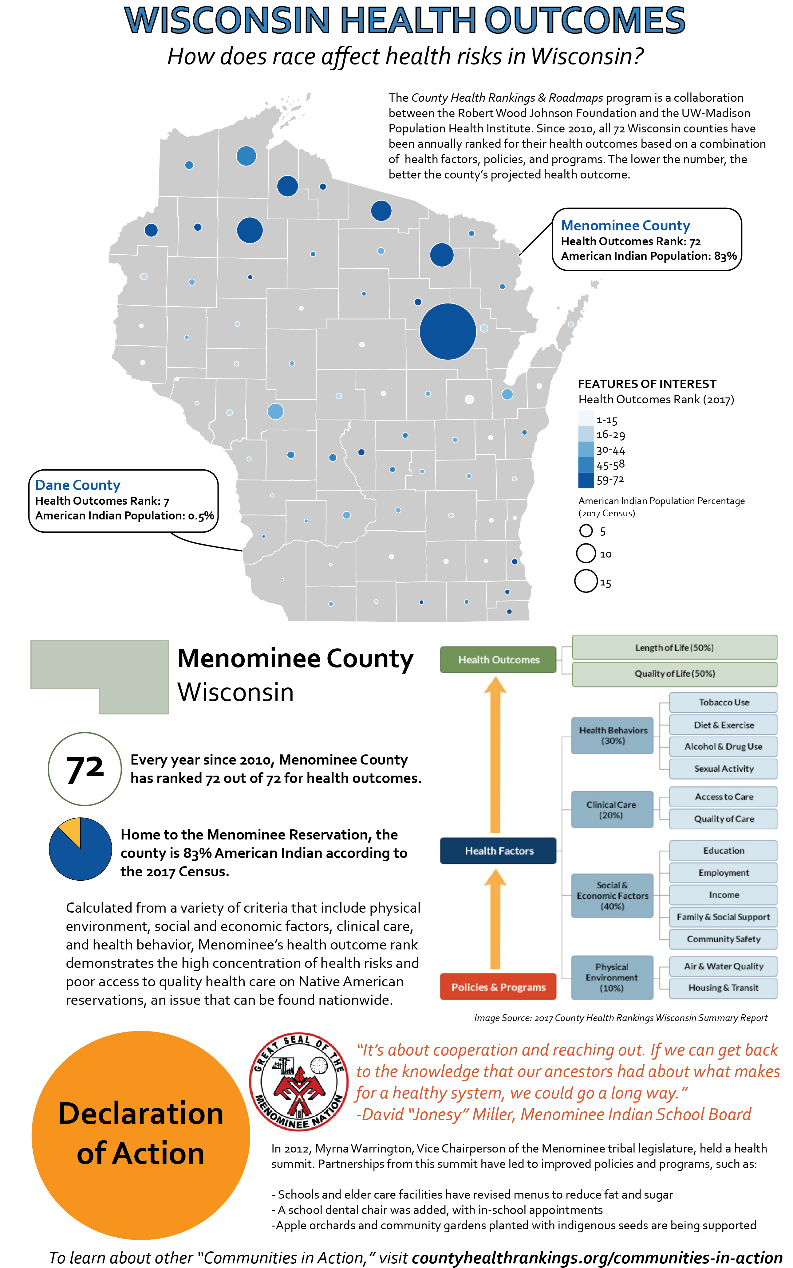
This infographic combines a bivariate graduated symbol and chloropleth map with further information to contextualize what the map depicts. I used this combination of map, image, and text to give an integrated and coherent representation of health outcomes in Wisconsin. In particular, I wanted to demonstrate that counties with a high American Indian population percentage tended to have higher health risks because of inadequate access to a full range of health care services. The infographic also includes next steps of action and how to get involved.